IDGRR Design System
The colors, type, components, and voice that shape every page of IDGRR.
Overview
A live mirror of the system that ships in the IDGRR site. Every swatch, button, and component reads from the same tokens used everywhere else — switch themes and the whole page repaints.
The five rules
If you only remember five things from this guide.
- Use semantic tokens (
bg-card,text-amber) — neverbg-whiteor hex. - Amber is the only brand accent. No new colors without adding a token.
- Stack vertically by default. Reach for grids only when content is tabular.
- Every form field is Label → Control → Hint → Message. No exceptions.
- Mobile first, AA contrast, keyboard reachable, motion-safe.
Jump to a section
Color, type, spacing, motion — the building blocks.
Buttons, inputs, cards, navigation, and dialogs.
Page headers, status tabs, form dialogs, toasts, and more.
Mission, voice, and write-like-this examples.
AA contrast, keyboard, motion-safe defaults.
Developer docs and how to export this guide.
Live, not theoretical
Who it's for
How to use it
Color
All color is expressed as HSL CSS variables. Eight themes repaint these tokens — components never reference raw colors.
Palette at a glance
Six token families compose every screen. Pick the family first, then reach for a specific token below.
Primary action, links, focus rings, accent dividers.
Use for: CTAs, active nav, icon foregrounds.
Page, card, and overlay backgrounds.
Use for: Layouts, cards, dialogs.
Body copy, secondary text, hairlines.
Use for: Headings, paragraphs, dividers.
Errors, warnings, info, success cues.
Use for: Alerts, toasts, form messages.
Dedicated dark surface for the global footer.
Use for: Footer only — never on body content.
Admin and member portal nav surface.
Use for: Sidebar shell, active item, hover state.
Surface & UI tokens
--backgroundhsl(—)--foregroundhsl(—)--cardhsl(—)--card-foregroundhsl(—)--popoverhsl(—)--primaryhsl(—)--primary-foregroundhsl(—)--secondaryhsl(—)--mutedhsl(—)--muted-foregroundhsl(—)--accenthsl(—)--borderhsl(—)--inputhsl(—)--ringhsl(—)--destructivehsl(—)Amber accent system
--amberhsl(—)--amber-hoverhsl(—)--amber-activehsl(—)--amber-tinthsl(—)--amber-palehsl(—)--icon-bghsl(—)--cta-bghsl(—)--cta-fghsl(—)Footer tokens
--footer-bghsl(—)--footer-fghsl(—)--footer-linkhsl(—)Sidebar tokens
Dedicated palette for the admin and member portal sidebars. Mirrors the main token set but tuned for a darker, denser nav surface.
--sidebar-backgroundhsl(—)--sidebar-foregroundhsl(—)--sidebar-primaryhsl(—)--sidebar-primary-foregroundhsl(—)--sidebar-accenthsl(—)--sidebar-accent-foregroundhsl(—)--sidebar-borderhsl(—)--sidebar-ringhsl(—)Icon-circle pattern
Amber icon foreground on a soft --icon-bg circle is the signature feature-icon treatment. The same shape scales from tiny bullets to large hero tiles.
h-1.5 w-1.5 bg-amberw-7 h-7 bg-icon-bg text-amberw-8 h-8 bg-icon-bgw-10 h-10 bg-icon-bgw-12 h-12 bg-icon-bgw-14 h-14 bg-icon-bgw-16 h-16 bg-icon-bgw-16 h-16 bg-amber/10w-12 h-12 bg-amber/15Always pair amber icon foreground with a soft --icon-bg or amber tint background — never amber-on-white or amber-on-amber.
Typography
System sans-serif stack for performance and familiarity. Bold headings, comfortable body, no display fonts.
-apple-system, BlinkMacSystemFont, "Segoe UI", sans-seriftext-4xl md:text-6xl font-bold leading-tightGive goldens a second chance
text-3xl md:text-4xl font-boldEvery dog has a story
text-2xl font-boldFoster a Golden
text-xl font-boldHow adoption works
text-lg font-semiboldApplication status
text-lg font-normal leading-relaxedOpen your home temporarily — we cover the costs while you provide the love.
text-base font-normal leading-relaxedIdaho Golden Retriever Rescue (IDGRR) is a 501(c)(3) nonprofit dedicated to the rescue, rehabilitation and placement of surrendered Golden Retrievers.
text-sm font-mediumLogin required
text-xs font-normal text-muted-foreground© 2026 IDGRR. A 501(c)(3) nonprofit.
Weights
Inline link
Body copy can include an inline amber link that underlines on hover. Use sparingly — most navigation belongs in buttons or nav.
Spacing & Layout
Tailwind 4-px scale. Generous spacing over dense layouts. Section rhythm anchors the page.
Spacing scale
space-14pxspace-28pxspace-416pxspace-624pxspace-832pxspace-1248pxspace-1664pxContainer & gutters
max-w-6xl with px-4 sm:px-6 lg:px-8 gutters.Reading width
Long-form text caps at max-w-3xl (~768px) so lines stay between 60 and 80 characters. This keeps reading comfortable on every screen — including narrow tablets and split-screen desktop.
Responsive grid (1 → 2 → 3 → 4)
grid-cols-1 sm:grid-cols-2 md:grid-cols-3 lg:grid-cols-4
Padding rhythm
Canonical inner-padding values used across the site. These are the defaults — only deviate when a specific composition demands it.
| Region | Tailwind | Used for |
|---|---|---|
| Card body | p-6 (sm: p-4 mobile) | Default Card content padding |
| Card header | px-6 pt-6 pb-2 | Title + description region |
| Card footer | px-6 pb-6 pt-2 | Action row at the bottom |
| Section vertical | py-12 sm:py-16 lg:py-20 | Between hero / content blocks |
| Label → control | space-y-2 | Form field internal stack |
| Group → group | space-y-6 | Between form sections |
| Two-column form | gap-5 lg:gap-x-6 | Field grid gutter |
Card padding regions
Section vertical rhythm
Form-field rhythm
Grid layouts
Named recipes used across the site. The classes below are the exact strings used in production — copy them straight into a new view.
grid-cols-1 sm:grid-cols-2 md:grid-cols-3 lg:grid-cols-4 gap-6grid-cols-2 lg:grid-cols-4 gap-4grid-cols-1 lg:grid-cols-2 gap-5 lg:gap-x-6grid-cols-[16rem_1fr] · single column < lggrid-cols-2 md:grid-cols-4 gap-8Sits beside the hero on lg+, stacks below on mobile.
grid-cols-1 lg:grid-cols-[2fr_1fr] gap-6Shape, Border & Elevation
Soft, friendly rounding. Borders before shadows. Shadows reserved for true elevation.
Radius
rounded-smrounded-mdrounded-lgrounded-xlrounded-2xlrounded-fullElevation
shadow-noneshadow-xsshadow-mdshadow-lgshadow-xlshadow-2xlBorders before shadows. Reach for elevation only when a surface needs to read as lifted off the page (overlays, hover states, modals).
Border
The default border border-border is a 1px hairline in hsl(var(--border)). Width, direction, and color combine to express emphasis — always preferred over shadows for separation.
Widths
border border-borderborder-2 border-borderborder-4 border-borderDirectional
border-tborder-rborder-bborder-lUsed widely for sticky-bar bottoms, image strip splitters, and the row-divider pattern border-b border-border last:border-b-0 on form sections, tables, and TOC groups.
Tinted & state
Divider pattern
border-b border-border last:border-b-0
Focus rings
Rings live in the same stroke family as borders but render outside the element on keyboard focus. The full ring system (--ring, ring-amber, ring-offset-*) is documented in Accessibility.
Responsive Behavior
Mobile-first. Layouts collapse stepwise. Touch targets stay generous everywhere.
| Breakpoint | Min width | Intent |
|---|---|---|
| base | 0px | Single column. Hamburger nav. Stacked CTAs. |
| sm | 640px | Two-column grids appear. Inline padding grows. |
| md | 768px | Sidebars and richer multi-column layouts. |
| lg | 1024px | Full desktop nav. 3–4 column card grids. |
| xl | 1280px | Container hits max width. Wide composition. |
Iconography
Lucide outline icons. Functional, never decorative overload. Amber on icon-bg circles for feature cards.
Sizes
16px20px24px32pxCommon icons
Imagery
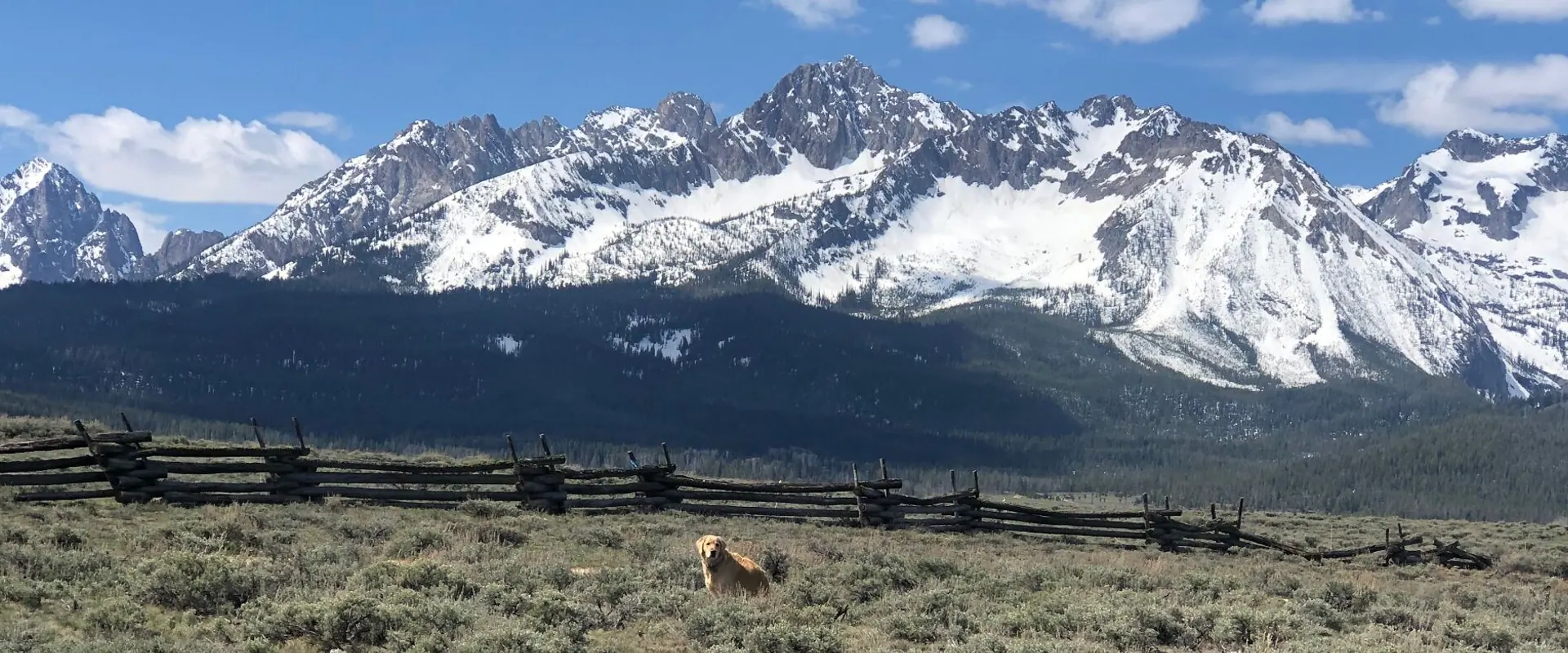
Scenic Idaho paired with golden retrievers. Natural light, hopeful, never glossy or studio-lit.
Mountain Hero pattern
Page Hero
White text over dark overlay
Full-bleed image · 40–55% black overlay · centered white headline + CTAs.
Common aspect ratios
Treatment
- Hero images: full-bleed with dark overlay.
- Feature images:
rounded-2xlwith light shadow. - Dog cards:
object-coverat the top of the card. - Avatars: circular (
rounded-full).
Motion
Subtle and helpful. Color ~200ms, transform ~300ms. No parallax, no bounce.
I just faded in
Standard entrance for sections and cards.
Hover lift
Hover me
Cards lift gently on hover.
Duration & easing
| Use case | Duration | Easing | Tailwind / lib |
|---|---|---|---|
| Color / opacity change | 150–200ms | ease-out | transition-colors duration-200 |
| Hover lift / transform | 250–300ms | ease-out | transition-all duration-300 |
| Section entrance (fade-in-up) | 500ms | ease-out | framer-motion duration: 0.5 |
| Dialog / Sheet open | 200ms | ease-out | Radix default |
| Skeleton pulse | 2s | ease-in-out, ∞ | animate-pulse |
Do & Don't
- Confirm an action (toast, button press).
- Draw the eye to a state change (badge update, save tick).
- Soften an entrance (fade-in-up on a section).
- Bounce or overshoot — feels noisy and slow.
- Parallax or looping decorative animation.
- Use transitions slower than 500ms on interactive UI.
Reduced motion
Components
Live, interactive examples. Hover, focus, and click — these are the same components used everywhere on the site.
Buttons — variants
Buttons — sizes
BoneDonateButton
Card
Standard card
Header, content, and footer regions.
Icon feature card
Amber circle, bold heading, short body, optional text link.
Form anatomy
Every form field on the site stacks the same four parts: Label → Control → Description (hint) → Message (error). Admin and member forms wire these to the Form + FormField + FormItem + FormControl + FormMessage primitives from react-hook-form.
We'll only use this for adoption updates.
Required for the application signature.
Enter a 5-digit ZIP code.
Looks good — we'll text you about meet-and-greets.
Disabled fields are demonstrated in Component Examples — they remove the field from Tab order and keep the label readable.
Form controls
Badges
Pop-ups & callouts
Six surfaces for revealing extra context: Tooltip for icon hints, Popover for compact menus, Dialog for blocking tasks, AlertDialog for destructive confirmation, Toast for transient feedback, and Alert for inline status banners.
Toast guidelines
import { toast } from "sonner"Confirms a completed write the user initiated. Past tense, no punctuation needed.
- • Saving a form, profile, or settings change
- • Sending an email, invite, or application
- • Archiving, restoring, or publishing a record
- • Copying a link or token to the clipboard
Example copy
- "Profile updated"
- "Application submitted"
- "Link copied to clipboard"
Reports a recoverable failure. State what failed, then suggest a next step.
- • Network or server errors on save / fetch
- • Permission denied on a non-blocking action
- • Upload rejected (size, type, quota)
- • Validation surfaced after submit, not inline
Example copy
- "Could not save changes. Try again."
- "Upload failed — file must be under 5 MB."
- "Network error. Check your connection."
Dismissal behavior
- • Auto-dismiss at ~4s for success and info; ~6s for errors so users have time to read.
- • Manual dismiss via swipe or the close affordance is always available.
- • Use
duration: Infinityonly when paired with an action button (e.g. "Undo"). - • Never use a toast for a blocking decision (use
AlertDialog) or persistent status (useAlert).
Inline alerts
Heads up
Action recommended
Something went wrong
Brand callout
We adopt within Idaho and the immediately surrounding region — applications from farther afield are reviewed case-by-case.
When to use: highlighting a non-blocking tip or eligibility note inside a longer page.
Focus ring
Press Tab to land on this button. Every interactive element shows a visible ring in hsl(var(--ring)).
Forms & pop-ups accessibility checklist
Verify forms, dialogs, popovers, and toasts behave correctly without a mouse and with a screen reader running.
Forms — labels, errors, and aria-live
- Every input has a programmatic
<Label htmlFor>— placeholders are never the only label. - Required fields use
aria-required="true"and a visible *; the asterisk is decorative (aria-hidden). - Hint text uses
aria-describedby; error messages addaria-invalid="true"on the input. - Inline error messages render inside
FormMessage(which is wired torole="alert"/aria-live="polite") so they announce on submit. - On submit failure, focus moves to the first invalid field — not just a banner at the top.
- Async status (saving, success, error) is announced via Sonner toasts (
role="status") — never silent.
Pop-ups — focus traps, escape, return focus
- Dialog / AlertDialog / Sheet: opening moves focus to the first focusable element inside; Tab cycles inside only (focus is trapped).
- Esc closes the overlay and returns focus to the triggering element.
- Background content is inert: it cannot be reached with Tab and is hidden from screen readers (
aria-hiddenon the rest of the page). - Every Dialog/Sheet has a
DialogTitle(visible orVisuallyHidden) — Radix throws a console warning otherwise. - Popover / Tooltip: dismiss on Esc and on outside click; focus returns to the trigger.
- Toasts (Sonner): rendered in an
aria-live="polite"region; errors userole="alert"so they interrupt politely. Auto-dismiss never strands a focused close button. - Inline
Alertblocks announce immediately when mounted — verify with a screen reader after a state change, not just on initial load.
Reduced motion
- Enable OS-level Reduce motion (macOS: System Settings → Accessibility → Display; Windows: Settings → Accessibility → Visual effects) and reload.
- Section entrances (fade-in-up) are reduced to a near-instant fade — no upward translate, no parallax.
- Hover-lift transforms are disabled; opacity / color transitions remain since they don't move pixels.
- Skeleton pulses still animate (decorative, low amplitude) but no auto-rotating carousels or looping decorative motion play.
- Use Tailwind's
motion-safe:/motion-reduce:modifiers, or auseReducedMotion()guard with framer-motion, for any custom animation.
Component Examples
Real-world combinations of border, elevation, and focus — showing how the primitives compose into the patterns you'll actually build.
Press Tab through the examples to see focus rings in action, hover to see elevation lift, and try clicking the disabled controls to confirm interaction is blocked.
Buttons
All six variants — flat by design, no elevation. Hover changes background; focus uses the app standard ring-2 ring-ring ring-offset-2.
Sizes: sm, default, lg, icon.
State previews — the first row is interactive (hover / Tab to it); the second row is a static preview that always shows the state.
hover:bg-primary/90
focus-visible:ring-2 ring-ring
disabled:opacity-50
ring-amber:Inputs
border-input · focus-visible:ring-2 ring-ring
ring-2 ring-ring ring-offset-2
disabled:opacity-50 · disabled:cursor-not-allowed
Same border + ring tokens as Input.
Cards
Cards aren't focusable by default. Each example below is wrapped in a focusable region so you can hover for the lift transition and Tab to see the focus ring on the surface itself.
Default card
Border + shadow-xs → hover:shadow-md
Elevated card
shadow-lg → hover:shadow-xl
Brand CTA card
border-amber/40 → hover:border-amber/70
Dialogs
Both dialogs use border + shadow-lg with a translucent overlay and built-in focus trap. Footer uses the standard grid grid-cols-2 gap-2 equal-width pattern.
Accessibility Checklist
Use this checklist to verify the gallery above behaves correctly with assistive technology. No mouse required.
Keyboard (Tab / Shift+Tab / Enter / Space)
- Tab cycles through every interactive element in DOM order — no skipped buttons, inputs, or focusable cards.
- Each focused element shows a visible ring (≥2px, ≥3:1 contrast against its surface).
- Disabled buttons and inputs are skipped by Tab (not just visually dimmed).
- Enter activates buttons and links; Space activates buttons and toggles checkboxes.
- Esc closes the open Dialog and AlertDialog and returns focus to the trigger.
Hover & pointer states
- Hover state is never the only signal — every hover change has a matching focus-visible state.
- Cursor changes to
pointeron real interactive elements only (not on decorative wrappers). - Hover lift / shadow on cards is mirrored by the focus ring on the same card when reached via Tab.
Screen reader (VoiceOver / NVDA / TalkBack)
- Each button announces its accessible name (visible label or
aria-label), role, and disabled state when applicable. - Inputs announce their associated
<Label>text, type, and disabled/required state. - Opening a Dialog announces the dialog title and description; focus moves into the dialog.
- Closing a Dialog returns focus to the triggering element and announces nothing stale.
- Decorative icons (e.g., the bone in
BoneDonateButton) are not announced separately — only the button label.
How to test
- macOS VoiceOver:
Cmd + F5to toggle. UseCtrl + Option + ←/→to navigate. - Windows NVDA:
Ctrl + Alt + Nto start. Use arrow keys + Tab to navigate. - Chrome DevTools: Open the Accessibility panel under Elements to inspect computed name, role, and state for any node.
Page Header
Every admin page opens with the same title block — title, optional subtitle, and one right-aligned action.
Members
Adopters, fosters, volunteers, and donors — everyone with an account.
Below the header sits the page's content (table, list, dashboard, form…).
When to use
Top of every admin and member portal page.
One primary action only — secondary actions belong in row menus or toolbars.
Where it lives
src/components/shared/PageHeader.tsx
Used across /admin/* management pages and member-portal screens.
Status Tabs
A pill-shaped tab bar with counts. Used to slice a list by lifecycle status — applications, dogs, surrenders, donors.
Active: pending. Zero-count tabs hide automatically (the active tab always stays visible).
When to use
A list with 3–7 mutually-exclusive lifecycle states.
Counts come from a single query so they stay in sync with the list below.
Where it lives
src/components/shared/StatusTabs.tsx
Adoption Applications, Surrenders, Dogs, Donors, Members, Stories, Memorials, and most other admin lists.
Data Toolbar & Layout
The standard search + filters + view-switcher toolbar paired with a view-aware list. Row 1 is search; row 2 is split into three equal thirds: Filter By, Sort By, and Layout By. Card view on mobile is forced; desktop respects the user's last choice.
When to use
Any admin list where a user might search, sort, filter, or change layout.
Pair with StatusTabs above the toolbar when there are lifecycle states.
Where it lives
src/components/shared/DataToolbarV2.tsx + InlineFilterPanel.tsx + DataLayout.tsx
Filter open/closed state and view choice persist inlocalStorage per page.
Form Dialog & Unsaved Changes
The standardized footer (full-width buttons, primary on the right) plus the discard-changes guard that protects every dirty admin form.
Footer rules
Two columns, gap-2, both buttons full-width.
Primary action on the right (Save, Submit, Confirm).
Secondary on the left (Cancel, Back, Close).
Destructive confirmations use AlertDialog, notDialog.
Unsaved-changes guard
Wire useUnsavedChangesGuard into every form that mutates data. It intercepts in-app navigation and the browser beforeunload event.
For dialog close, render DiscardChangesDialog when the form is dirty (as shown above).
src/hooks/useUnsavedChangesGuard.ts ·src/components/shared/DiscardChangesDialog.tsx
View Detail Dialog
A read-only modal for inspecting a single record before deciding whether to edit. Optional cover image, label-value rows, and an Edit handoff.
When to use
From a list row, when a user wants to scan details without losing list context.
For full editing, route to a dedicated detail page or open a form dialog.
Where it lives
src/components/shared/ViewDetailDialog.tsx exports bothViewDetailDialog and DetailRow.
Used across admin Applications, Surrenders, Donations, and other single-record inspection flows.
Toasts
Sonner toasts are how the app reports the outcome of user-initiated writes. Always paired with the action that triggered them.
When to use which
toast.success — past-tense confirmation of a write the user initiated.
toast.error — recoverable failure; state what failed and the next step.
toast() — passive background info (autosave, sync).
toast.promise — long-running operation with loading → result.
Don't use a toast for…
A blocking decision — use AlertDialog.
Persistent status that needs to stay on screen — use Alert.
Inline form validation — use FormMessage next to the field.
Empty States & Friendly Errors
When a page has nothing to show, we celebrate the reason or guide the user forward — never a blank screen.
404 — Page Not Found
Ruh-Roh!
Page Not Found
This page may have wandered off… but don't worry, there are plenty of golden moments waiting for you back home.
Shown when a user hits a route that doesn't exist (src/pages/NotFound.tsx).
Public Dogs — All Adopted
All Our Dogs Found Homes! 🎉
This is actually wonderful news — every single pup has found their forever family!
New dogs become available regularly, so check back soon. Or better yet, join as a member to get notified the moment a new golden is looking for a home.
Shown on /dogs when no available dogs match the public list.
Member Dashboard / Member Dogs — All Adopted
All Our Dogs Found Homes! 🎉
Every pup has found their forever family — wonderful news!
New dogs become available regularly. We'll notify you when a new golden is looking for a home.
Shown to logged-in members on /member/dashboard and /member/dogs when no dogs are available.
Filter Empty
No dogs match your filters. Try adjusting your search or filters.
Shown on /dogs and /member/dogs when search or filter criteria are active but return zero results.
Friendly Errors
Hard-failure states use a destructive-tinted variant of the empty-state pattern, with a clear retry CTA. Never blame the user, never show a raw stack trace.
We couldn't load this list.
Something went wrong on our end. Please try again — if it keeps happening, let us know.
Use this for query / fetch failures on list pages and dashboards. For inline form errors, use FormMessage; for transient failures the user can ignore, use toast.error.
Always include
An icon (XCircle or AlertTriangle) on the destructive tint.
A headline that names what failed in plain language.
One sentence of context — never a stack trace.
A primary "Retry" CTA and a secondary escape hatch.
Never do
Blame the user ("You haven't…").
Show "Error 500" or a raw exception message.
Let the page render blank with no recovery path.
Use only a toast for a hard failure that blocks the whole page.
Mission & Non-negotiables
Who IDGRR is, and the brand rules that protect it. Read this before writing any new copy or designing any new screen.
Mission
Audience
Non-negotiables
- Bright, open, friendly. Never trendy startup, luxury, or rustic-western.
- Amber is the only brand accent. Don't introduce blue, green, or purple.
- Scenic Idaho photography paired with golden retriever imagery.
- Cards, soft borders, rounded corners, restrained shadows.
- CTAs stay practical: adopt, foster, volunteer, donate, remember.
- No cartoon dogs, handwritten fonts, or decorative illustration.
Voice
Warm and direct. Compassionate but never melodramatic. Clear, welcoming, informational first — inspirational second. Always grounded in Idaho.
We sound like…
A neighbor who knows what they're talking about.
A volunteer board describing real work, in plain language.
An adopter sharing the practical side of the process.
We do not sound like…
A startup pitch deck or a luxury pet brand.
A guilt-trip fundraising letter.
A breeder website or a generic "pet care" blog.
Write like this / Avoid
Concrete examples lifted from public pages and CTAs. When in doubt, copy the cadence on the left.
Write like this
"Give golden retrievers a second chance at life."
"Every contribution helps us save more dogs."
"Open your home temporarily — we cover the costs while you provide the love."
"Join our community through donations, volunteering, or attending events."
Avoid
"Disrupting pet rescue through innovation."
"A premium canine lifestyle experience."
"Bold, edgy, rebellious brand language."
Excessive emotional manipulation or fundraising clichés.
Accessibility
WCAG 2.1 Level AA across all eight themes — verified by automated CI.
Contrast: Body text ≥ 4.5:1, large/UI text ≥ 3.0:1 on every theme.
Focus: Always visible. Uses hsl(var(--ring)) — never removed.
Color independence: States never depend on color alone — icons, labels, and text reinforce.
Touch targets: Minimum 40×40px on mobile.
CI: .github/workflows/a11y-contrast.yml blocks merges that drop a tracked pair below threshold.
Ring & Focus Variants
Press Tab to focus the buttons below — focus-visible only triggers on keyboard focus, not mouse clicks.
Ring widths
focus-visible:ring-{1|2|4}
Ring colors
focus-visible:ring-{ring|amber|destructive}
Ring offsets
ring-offset-{2|4} ring-offset-{background|card}
App standard: focus-visible:outline-hidden focus-visible:ring-2 focus-visible:ring-ring focus-visible:ring-offset-2 — applied to every shadcn button via src/components/ui/button.tsx.
Brand-tinted rings (ring-amber) are reserved for amber CTAs like BoneDonateButton. Use ring-destructive for danger actions; everything else uses the default ring-ring token.
Tracked contrast pairs
| Pair | Threshold |
|---|---|
| Body text on background | 4.5:1 |
| Body text on card | 4.5:1 |
| Body text on popover | 4.5:1 |
| Body text on secondary | 4.5:1 |
| Body text on muted | 4.5:1 |
| Muted text on background | 4.5:1 |
| Muted text on card | 4.5:1 |
| Muted text on popover | 4.5:1 |
| Muted text on secondary | 4.5:1 |
| Muted text on accent | 4.5:1 |
| Ghost hover text on accent | 4.5:1 |
| Default button label | 3.0:1 |
| Destructive button label | 3.0:1 |
| CTA button label | 3.0:1 |
| Default hover on background | 3.0:1 |
| Default hover on card | 3.0:1 |
| Destructive hover on background | 3.0:1 |
| Destructive hover on card | 3.0:1 |
| Secondary hover on background | 4.5:1 |
| Secondary hover on card | 4.5:1 |
| Primary text link on background | 4.5:1 |
| Primary text link on card | 4.5:1 |
| Amber link on background | 4.5:1 |
| Amber link on card | 4.5:1 |
| Focus ring on background | 3.0:1 |
| Focus ring on card | 3.0:1 |
| Focus ring on sidebar | 3.0:1 |
| Sidebar text on sidebar bg | 4.5:1 |
| Sidebar hover row (accent) | 4.5:1 |
| Sidebar active item label | 3.0:1 |
| Footer text on footer bg | 4.5:1 |
| Footer link on footer bg | 4.5:1 |
Verified across 10 themes: Light · English Cream · Golden Retriever · Warm Sunset · Cream & Ink · Night & Sand · Chocolate Lab · Twilight · Dark · Midnight Gold.
For Developers
The single sources of truth — and a few gotchas worth remembering.
Where things live
src/index.css — every theme block & CSS variables.
tailwind.config.ts — Tailwind tokens & color shortcuts.
src/hooks/useTheme.tsx — theme switching & persistence.
src/lib/theme-tokens.ts — contrast pair manifest for CI.
src/components/ui/* — shadcn primitives.
Rules to remember
No raw colors. Always use semantic tokens (bg-card, text-amber).
HSL only. All CSS variables are HSL triples — wrap with hsl(var(--token)).
Dialog footers use grid grid-cols-2 gap-2 with full-width buttons.
Radix Select needs undefined, not "", for empty values.
ChartContainer from shadcn requires explicit config prop.
src/index.css and this page will reflect it automatically.Export Guide
Take this guide with you. PDF for review, Markdown for source-of-truth diffs.
Download PDF
Uses your browser's "Save as PDF". Print styles hide the sidebar, search, and TOC; brand color swatches stay rendered.
Download Markdown
Canonical narrative copy from src/content/design-system.md. No live demos or swatches — diff-friendly text.